How To Make Your Rental Property Feel Like Home

Living in a rental property, sometimes it can be challenging to make the house feel more like a home. Many landlords have rules against painting or putting nails in the walls, which leaves you wondering what you can do to make your rental property feel more like yours. 

Let’s take a look at 4 design ideas to brighten up your rental property and make it more inviting.
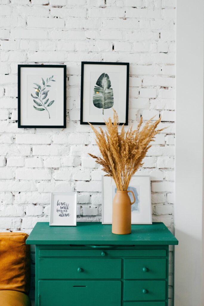
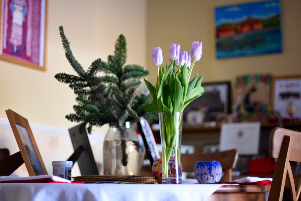
Create An Entryway

Entryways are a great way to welcome guests and set the tone for the rest of your home. If you have space, set up a table with a lamp and decorative flowers. This is a great way to add color and your personal touches that guests will notice as soon as they walk in.

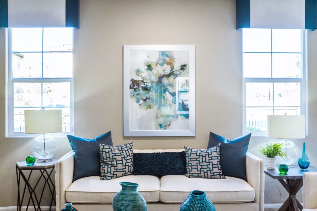
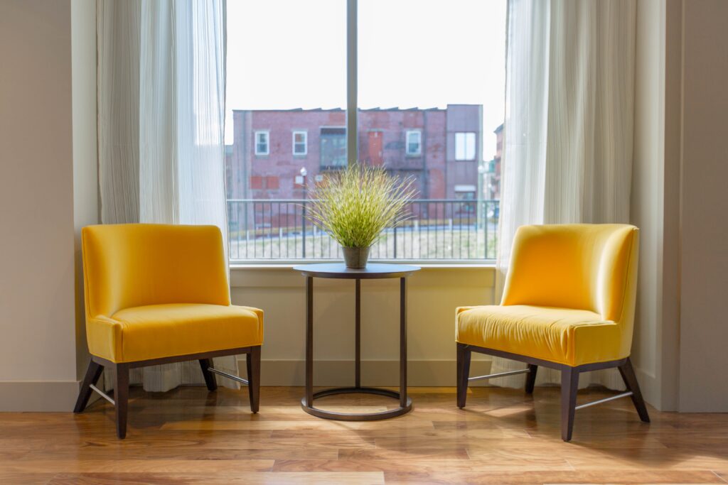
Brighten Up With Color

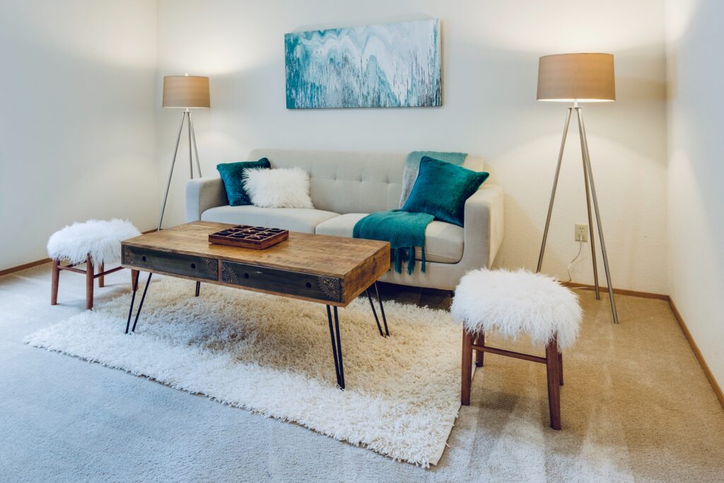
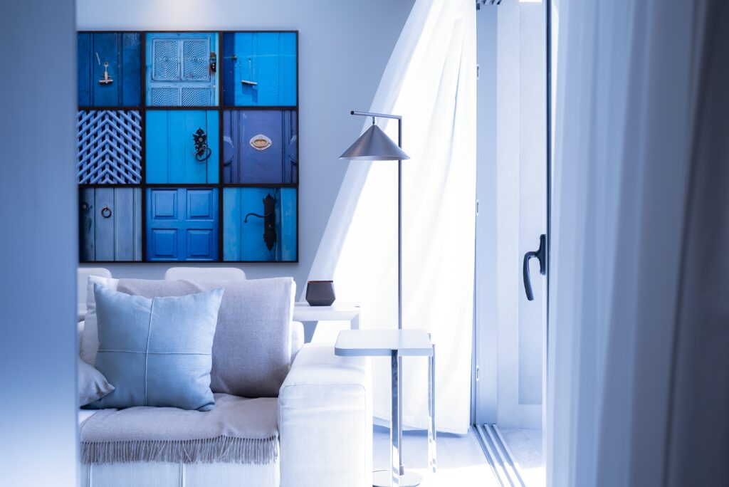
Many rental properties often have neutral wall colors and flooring. Just because you can’t paint the walls doesn’t mean you can’t add color! Try adding bold curtains or bright-colored pillows to add some personality. A new rug is another great way to add color and would be a great addition to warm up your living room. 

Let There Be Light

Lamps and lighting can help you see your rental property in a new light. If your landlord will allow it, try switching out the dining room or kitchen lighting with a new modern lighting fixture. If not, adding lamps to fit your style will help brighten things up. Natural lighting is also a game changer, so try replacing the original blinds and curtains with sheer white curtains to lighten up the home.

Removable Wallpaper & Contact Paper

If you don’t want to put in the time to do an entire room, remember that a little can go a long way. Try adding an accent wall in your kitchen or living room or updating your countertops with contact paper. If you don’t like it, it can easily be removed, and you can try a new design!

There are various ways to spruce up your rental, but incorporating these four ideas will make a world of difference! If you have any questions or need recommendations, reach out to us! We are always here to help.

2022 Color of the Year: Evergreen Fog

Evergreen Fog is the 2022 Color of the Year. Next year’s color is a mid-tone grey-green. 

Why Evergreen Fog

Sherwin-Williams chooses the color of the year by researching design trends around the world. The trends they found were warm neutrals, sustainability and organic living, and organic textiles and natural materials. The color is found in the following color collections:

  • Pottery Barn – Fall/Winter 2021
  • Pottery Barn Kids – Fall/Winter 2021
  • Pottery Barn Teen – Fall/Winter 2021
  • West Elm – Fall/Winter 2021

Sherwin-Williams found that people are leaning into using more color in their homes. From Pinterest and Google searches, there’s been more interest in greens. Green varies from rich and diverse colors that can appeal to everyone. The color adds depth and interest to a space while also mimicking nature and providing a calming hue. 

Where and How to Use Evergreen Fog

Evergreen Fog works excellent when paired with natural materials like textural linen and wool. It would be a great splash of color in a home office, living room, or bathroom as a subtle statement shade. It could also be used in a bedroom, as a soothing color to promote relaxation. All in all, it’s the perfect shade of grey-green that feels elegant yet comfortable. 2022’s color of the year pairs best with other earthy neutrals like white, beige, a room with light wood tones with darker elements like matte black fixtures or bronze fixtures. It coordinates best with these Sherwin Williams colors: Neutral Ground, Dried Edamame, and Ethereal White. 

When you work with TALK Property Management, we make your investment property ready and can help you remodel. We are here to help: (512) 721-1094 or dbrown@talkpropertymanagement.com

Photo credit to Sherwin-Williams website.

Hot Summer Color Trends for Austin Investors

If you’re looking to spruce up your home for summer or need some summer inspiration for decorating your investment property, check out these hot summer color trends from HGTV.

1. A Touch of Spring Green

alexandra-gorn-W5dsm9n6e3g-unsplash

Spring Green is a vibrant mix between turquoise and sea green. This color works best as an accent when surrounded by primarily neutral colors. It can be just a pop of color like pillows or larger by choosing a furniture piece with this color. 

2. Regal Purple

ed-pirnak-ZXirgGVtgAs-unsplash

Regal purple can easily be used all year round for decor, but it especially pops during summer. You can even incorporate outside when you use fresh lilacs or liatris to accentuate the purple in the room. 

3. Blue

neonbrand-Wp7t4cWN-68-unsplash

Blue is a great accent color as well since it can have a masculine and feminine appeal. If you don’t want to commit to painting with this color, let accessories do the job for you. A blue rug with matching pillows and accented table settings is a great option. 

4. Sunny Yellow

michael-browning-akz0w36DpM4-unsplash

Mimic the sun’s bright hues with a shade of daffodil to brighten up any all-white room. This color pairs great with white, black, or navy and can quickly transform a space into a cheerful room.

5. Turquoise

francesca-tosolini-KJFKCed0YKo-unsplash

We already mentioned blue, but we need to mention this particular shade of blue: turquoise! This color complements mid-century modern furnishing to help give the room a retro, urban feeling. The beauty of this color is its versatility in using it by itself or toning it down with muted hues. 

6. Slate-Blue

vinicius-amnx-amano-ALpEkP29Eys-unsplash

The opposite of turquoise is slate blue, and it’s also a great color for summer too! While not as bright and cheerful as its blue cousin, slate blue can represent coastal inspiration and ocean waves, making it a hot summer color style. This color works best when paired with neutral furniture and accessories. 

7. Yellow Green

dennis-cortes-_veirRXwPOQ-unsplash

If you’re looking for another color to make your home pop, yellow green is the color for you! This bright color pairs well with browns and creams and can be combined with darker shades of greens as accents. Yellow green will add a whimsy, graceful touch to your room. 


If you need help with your rental property, contact us today! Reach out to TALK Property Management– We are here to help: (512) 721-1094 or dbrown@talkpropertymanagement.com.